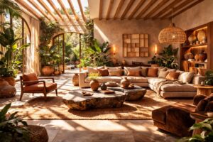
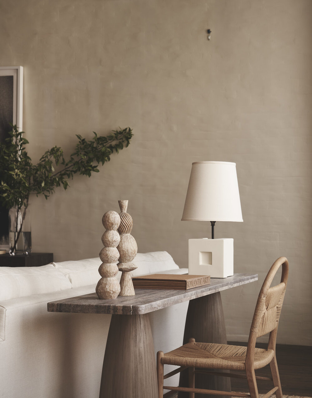
Among all the possibilities provided to us by the color spectrum, neutral tones are the ones that we select most often for their versatility, timelessness, and harmony. These colors can become the enveloping character of an interior design or they can be used as the base hues to highlight brighter ones. Either way, neutrals simplify the color coordination process as they pair well with multiple tones and their serene quality allow other accessories or furniture to pop out. Seeing as even neutrals belong to a wide spectrum, we have compiled a few of the most trending tones that are making a statement in 2023.
Cotton
There is something pure and welcoming about cotton. Perhaps it’s the subtle yellow undertones that give it a warming quality or it’s close association with a soft texture and organic composition. It is precisely this creamy off-white shade that is often used as a calming backdrop for interior spaces as it can instantly create an open and light-filled impression.
In addition, this color is naturally compatible with furniture such as sofas, lounge chairs, or dining chairs as it adds elegance through a minimalist approach. At the same time, the clarity and simplicity found in this color does not mean you cannot add some details. In fact, cotton allows you to play with different accent colors, patterns and textures by creating contrasts that highlight other elements in a room. Imagine combining a charcoal grey coffee table with a creamy white cotton rug that accentuates a modern composition.
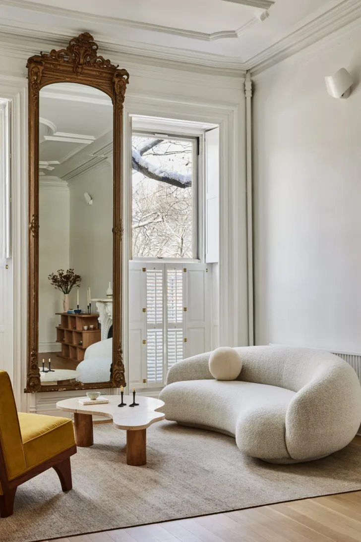
Abalone
This color reflects faint notes of pink amidst a cloud of soft grey much like a muted version of the iridescent hues found in shells by the sea. This unique color can be spread across walls to evoke a sense of tranquility and connection with nature or it can be incorporated in upholstery and fabrics that express a sense of depth and dimension.
The allure of abalone works especially well when paired with neutrals like white, grey, or beige that highlight the enchanting quality of this tone. Even in smaller elements and accent pieces such as vases, decorative bowls, or mosaic tiles; this color adds an interesting visual effect paired with a sophisticated touch.
Playa arenosa
Hovering between a beige latte and sandy pink tones, Playa arenosa echoes the soothing effect found in coastal areas. If you are looking for a beach-inspired aesthetic or a touch of warm and natural beauty for your interiors, this is an ideal color choice to decorate your home.
Playa arenosa can be easily used as a tone for your flooring through materials such as light-colored hardwood, laminate, or tile. This shade brings about a natural fluidity that gives rooms a fresh impression. If you combine this with textiles, and accents with the same tone, the final product will evoke a definite sense of cohesiveness. For example, consider using curtains, bedding, or rugs in a Playa Arenosa shade with complementary coastal-inspired accents like seashells, driftwood, and coral themed décor to complete the tranquil beach atmosphere.
Iced mocha
This color instinctively reminds us of a relaxing summer day under the cool shade of a tree or café. This is precisely what ices mocha reflects with its characteristic milky brown color with pink undertones that works particularly well with beige and brown color palettes. The effect is a cozy and inviting atmosphere that radiated brightness instead of absorbing it.
Whether used across large surfaces such as walls and furniture pieces or in small amounts as an accent color; iced mocha can be easily paired with both earthy colors and cool neutrals like grey. Its brownish-grey tones work well in spaces focused on relaxation such as the bedroom and living room. It can even be used in a variety of materials from textiles like upholstery to raw materials like wood and stone. All in all, the warmth it reflects and it’s rich tones help bring together various elements and tones to create a cohesive and multi-layered design.
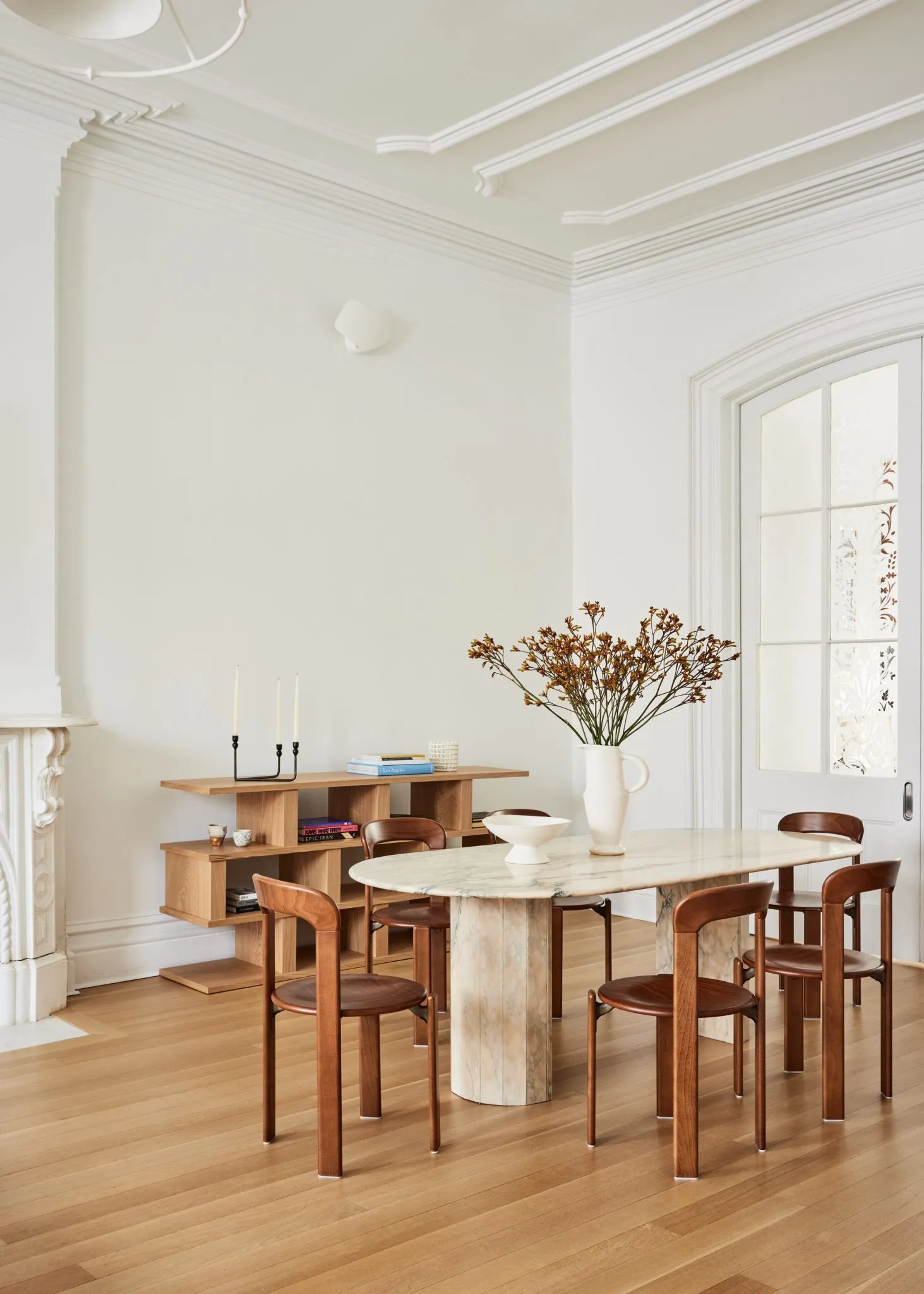
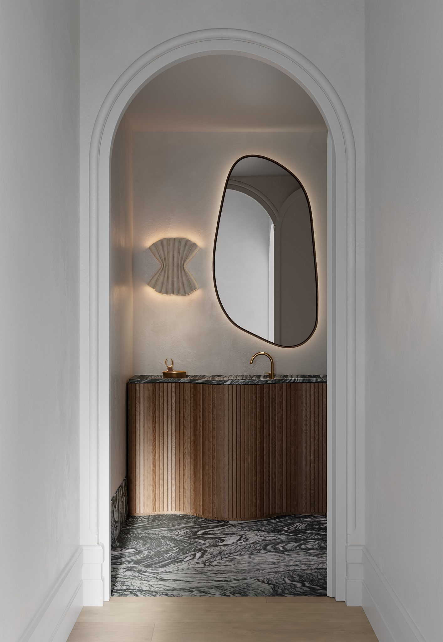
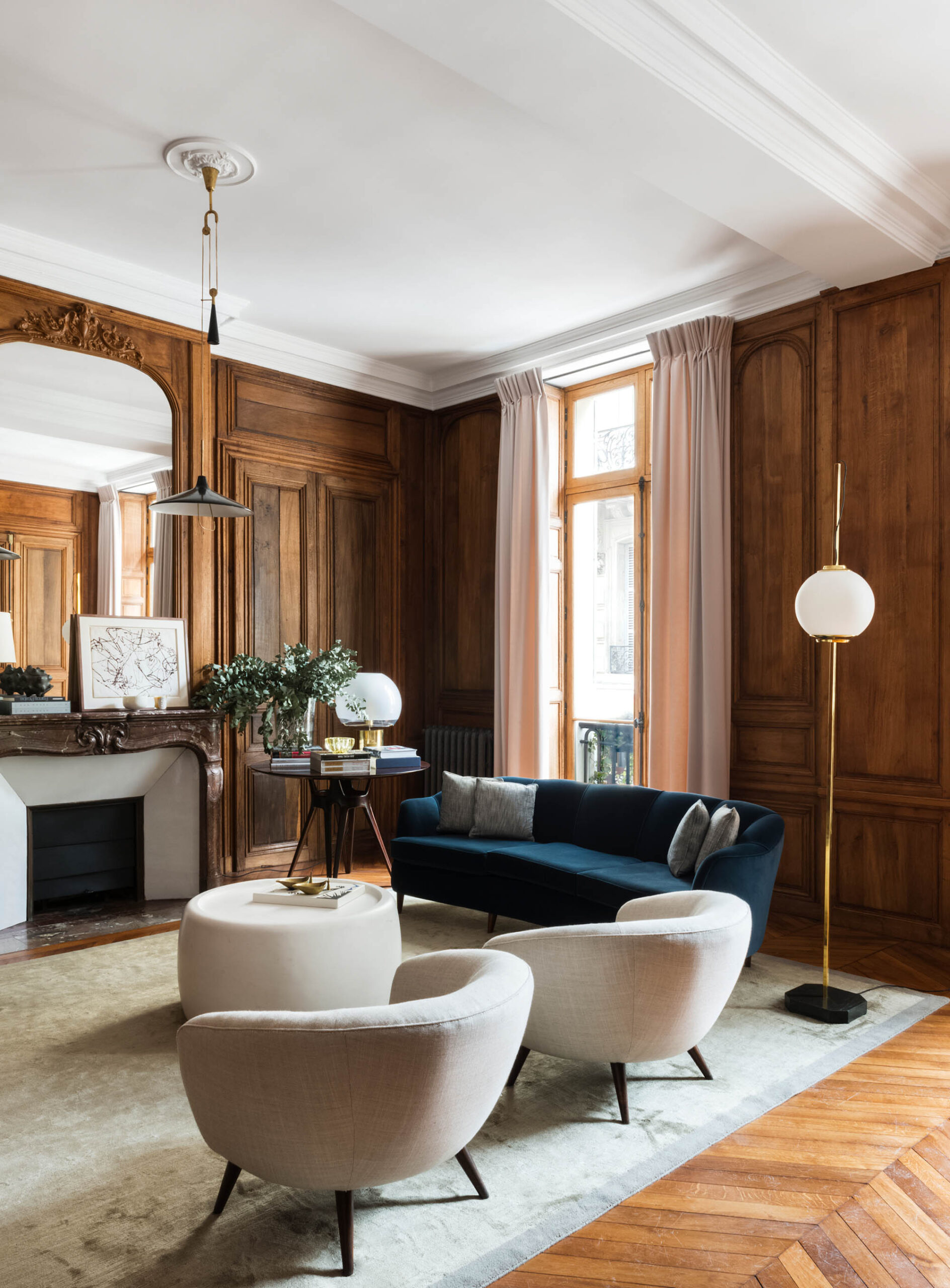
Greige
True to its name, this color is the product of the combination between grey and beige. This has become a popular among neutrals for its versatility with both cool and warm tones. As a wall color, greige can create a modern, minimalist look that pairs well with wooden furnishings and organic decorative items. Meanwhile, in fabrics its use has no limits as it can embellish curtains, upholstery, drapes, or rugs.
Using greige as a color scheme can prove to be easier than you imagine as it pairs well with other neutral tones like white or cream as well as bolder accent colors such as red and navy blue. This tone is indeed the go-to choose for creating a more cohesive and stylish space through its binding properties as a neutral tone.
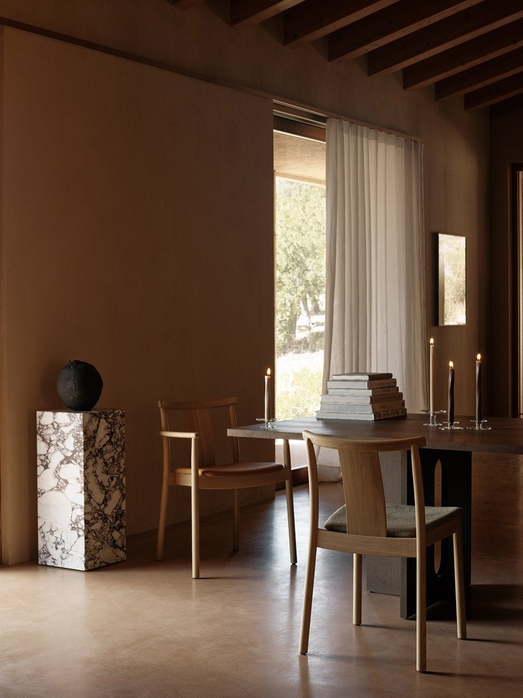
Taupe
This earthy color lies in the intersection between brown and grey which makes it an ideal choice as a primary color. Its brown tones exude coziness and warmth that is indispensable for any interior. This is why it is especially prominent in designs that seek an earthy feel by using it as a base color to complement brighter tones such as blue and green for a calming effect. On the other hand, taupe can also become an accent color to highlight other matching elements in a room such as decorative items like rugs, bookshelves, and accessories.
The naturally brown tones in taupe also make it the most instinctive choice for wooden finishes like furniture and cabinets. This leads to an organic composition that enables other natural materials like stone and metal to make a statement in your interior décor.
A parting note
The colors that comprise your interiors are responsible for establishing the atmosphere of your home and reinforcing a particular style. However, their most important contribution is the opportunity they provide for you to express yourself, play with different combinations, and to bring life to a space. In the case of neutrals, these colors can allow you to experiment with contrasts while providing a solid base for your design. Their clean and soothing quality instantly creates a modern and sophisticated look that creates an ideal stage for other elements like accessories and furnishing to stand out. This is why from the sea of neutrals out there, we have selected these six colors as important starting points and contemporary trend-markers to familiarize yourself with.