“Color provokes a psychic vibration. Color hides a power still unknown but real, which acts on every part of the human body.” – Wassily Kandinsky
If we take a step back to look at the world from a faraway perspective, the image we are presented with is a mosaic of infinite color combinations that evoke unique memories and emotions to each person. Our body unconsciously attaches predetermined responses to these colors and in turn, we also associate them with specific characteristics that influence the way we perceive our surroundings. Designers and painters are already familiar with the language of color and thus, they navigate through these visual and emotional connections to create beautiful works and spaces that are in tune with our state of mind. This principle is addressed in interior design through color psychology as a means to evoke a specific mood or atmosphere grounded on a carefully selected color palette.
As communication tools, colors signal certain actions and shared understandings within different communities. Not all shades and colors have the same meanings across all cultures. Red, for example, is associated with love and passion in Western cultures, in South Africa it is linked to mourning and in China it symbolizes happiness, good luck and prosperity. Nonetheless, certain congruent patterns can be discerned in Western societies that share similar associations with specific colors and their uses for different spaces. Here we present an overview of the main functions of certain colors in interior design and their influence on people’s emotions.
Warm colors
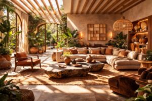
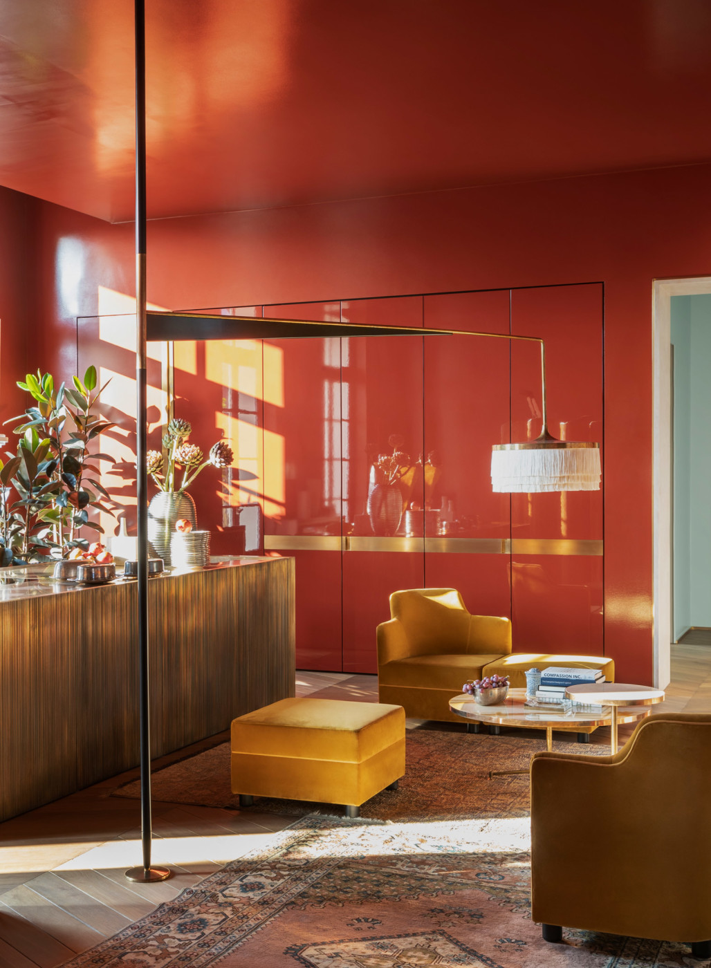
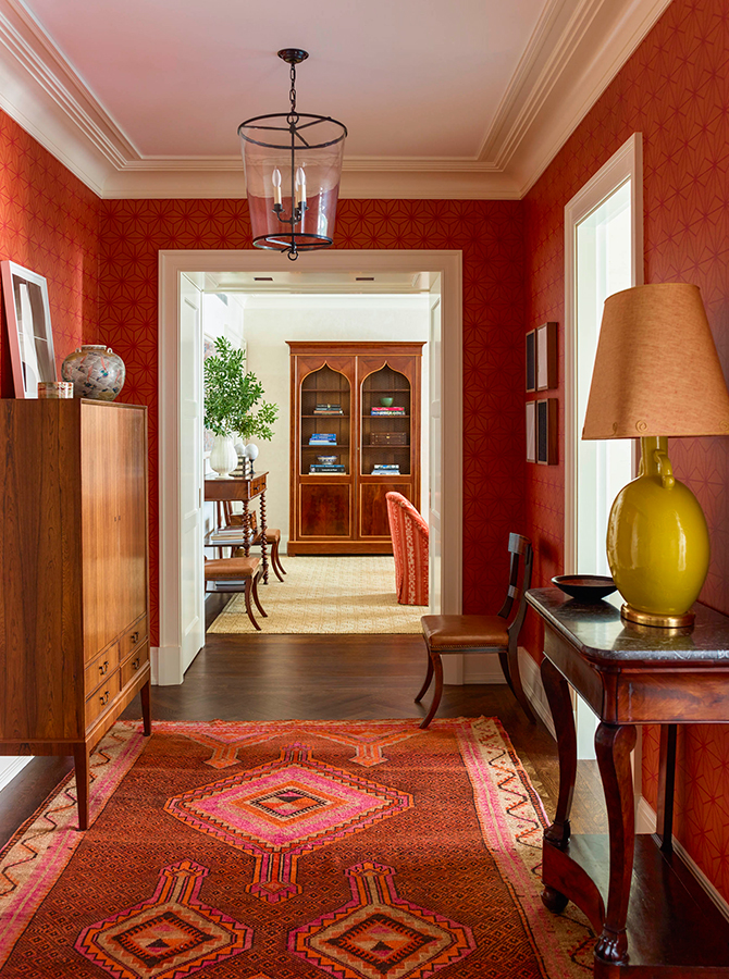
Red, orange and yellow are known as warm colors for their connection to the bold forces of nature such as fire and volcanoes and their dominant presence in the color spectrum. The feelings they evoke can range from warmth and comfort to anger and hostility; however when paired with the right furniture and décor, warm colors can become a powerful and modern statement.
Warm tones work especially well in large spaces since they radiate coziness and protection while also stimulating productivity and appetite. The living room or bedroom are ideal areas to show off warm colors by introducing a fireplace with a matching earth-red carpet or through bronze toned upholstery paired with wooden coffee or side tables. Another option for adventurous clients and designers is to cover the walls themselves in a glossy shade of red displaying a collection of photographs or artwork to breathe life and intensity into one’s home.
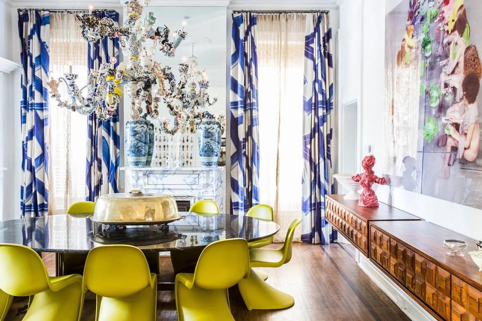
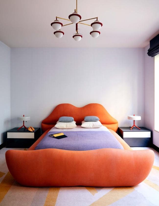
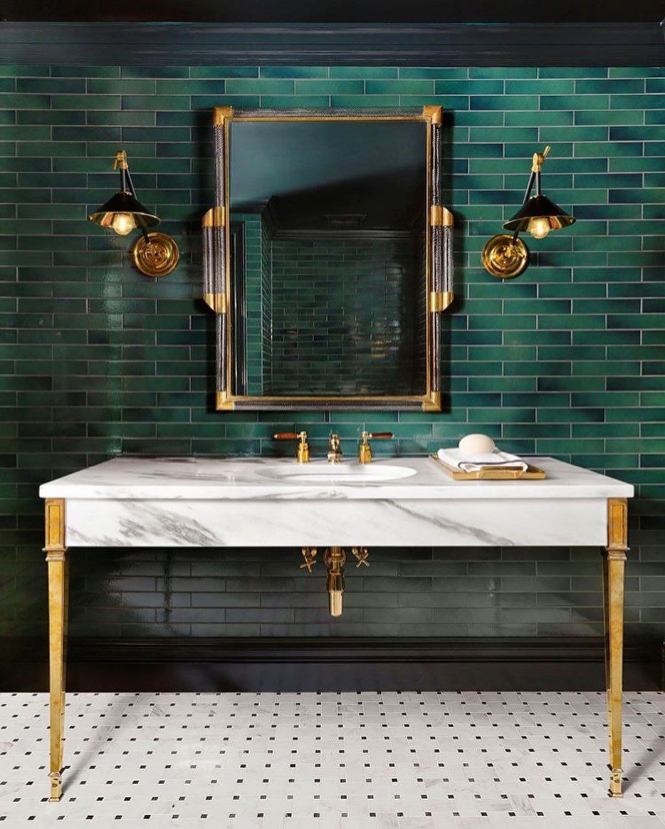
Cold colors
The blue side of the color spectrum, including shades of purple and green, belong to the category of cold colors. Often regarded as calming, cool colors can also be associated with sadness or indifference, for example, think of the phrase ‘feeling blue’. Nonetheless, interior designers are experts in highlighting the positive attributes of cool colors to induce a tranquil, healthy and wise impression through the right furniture and decoration arrangement.
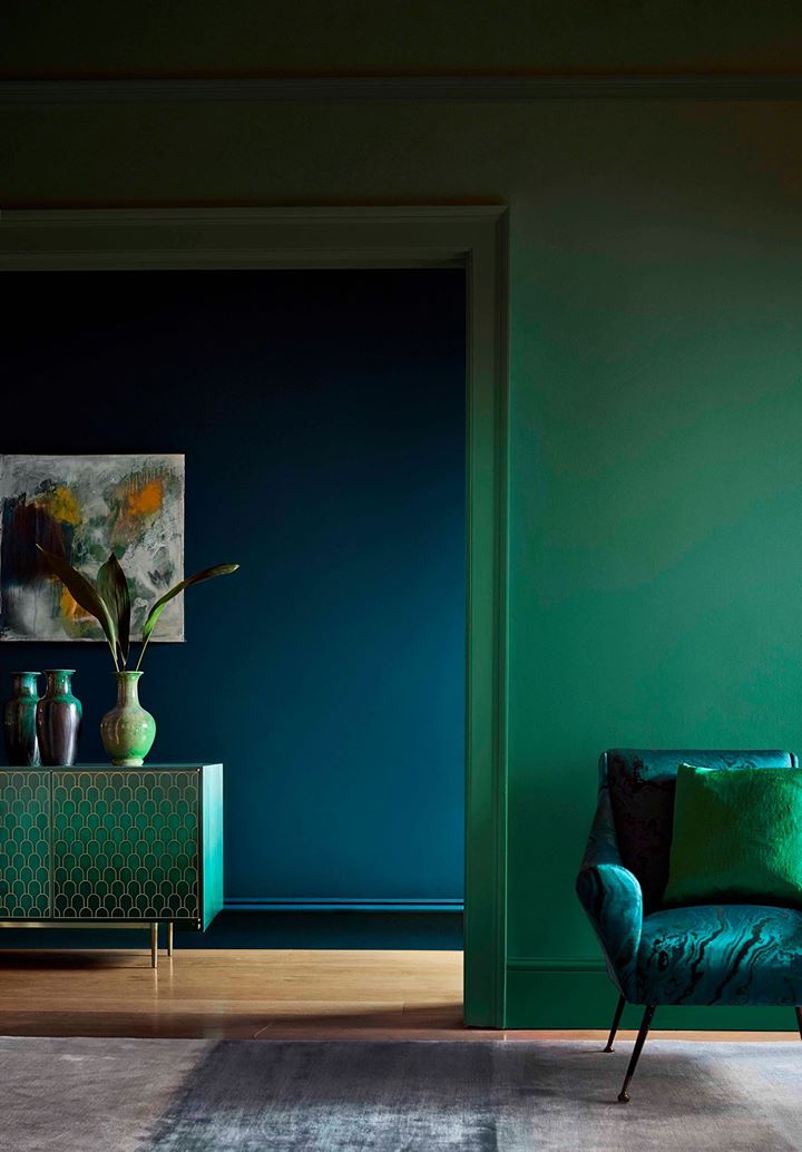
Unlike warm colors, cooler shades maximize the perceived space of a room which is why they are often highlighted in private rooms such as the bedroom, nursery, bathroom or office- places where concentration and tranquility is essential. The best way to pair these colors is with neutral finishes, bright pops of pink and orange decorations or even with large surfaces like a couch and bed featuring dark shades of blue and purple upholstery. On the other hand, cool tones also provide an excellent base to recreate monochromatic looks that display several pastel shades of the same color in rugs, sofas, curtains and bed frames.
Neutrals
Lastly, neutral tones are the threads that bind warm and cold colors together and the necessary ingredients to create balance within a room. These shades include black, grey, white and brown; all of which are eternally present in every designer’s palette due to their versatility and inconspicuous character. Such tones, subtly suggest feelings of security and tranquility, warmth or coolness- depending on the colors they are paired with. At the same time, shades like black and grey are often also used to radiate elegance and modernity without overwhelming the senses.
“The chief function of color should be to serve expression.” – Henri Matisse
Which colors speak to you the most and what do you want to express with them?