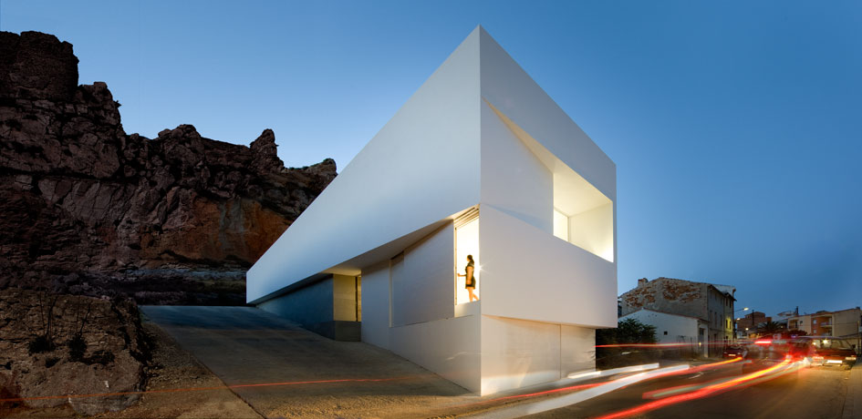
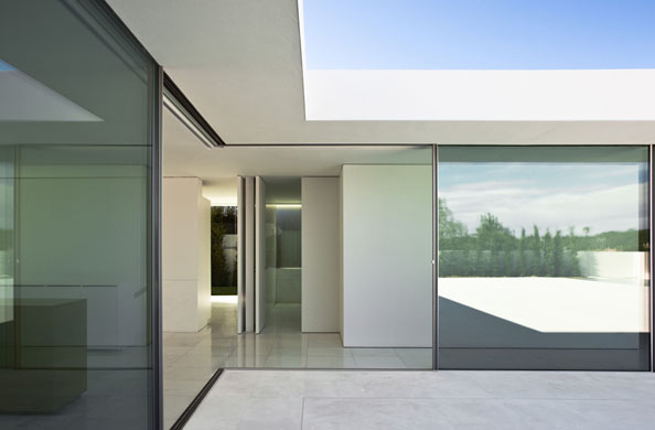
Based in Valencia, Spain, Fran Silvestre Arquitectos works on a range of projects, including public buildings, houses, and interior renovations. Starkly minimalist, his projects, often with sharp, though not overbearing or unpleasant, angles, are covered in smooth, white materials inside and outside.
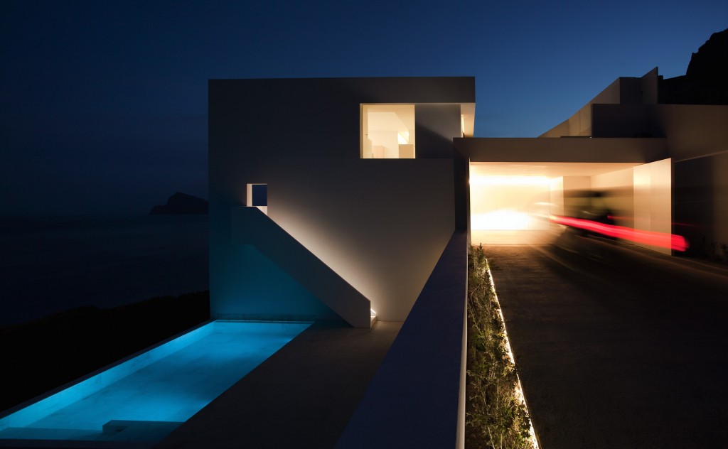
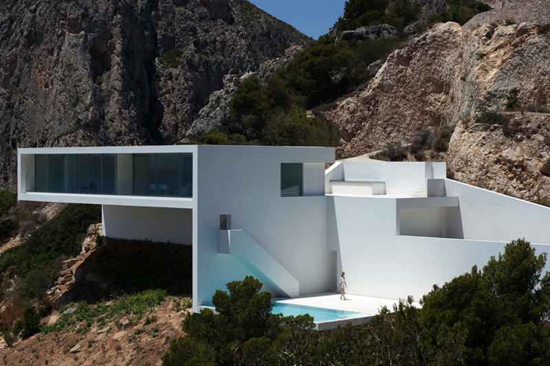
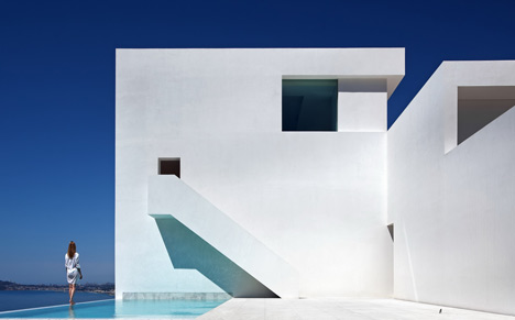
The Spanish designer’s minimalist approach to houses at first may sound out of place on a rocky cliffside overlooking the Spanish shoreline and blue ocean. The clean, geometric lines and white shell certainly does not blend into the beautiful natural terrain, but it does not distract from it either. His House on a Cliff, in Alicante, completed in 2012, provides shelter and views, but otherwise, lets its surrounding nature take the viewer’s attention.
Located seemingly in the middle of nowhere—what the firm has called “an abrupt plot of land”—the only thing to do is relax, and gaze out at the views. The rocky mountainside or beautiful shoreline and ocean can be seen from any view within or immediately without the house.
In order to minimize topographical changes, Silvestre arranged the living spaces over four floors. Where the topography was already fairly flat, the architect created a terrace level with pool overlooking the ocean. The upper level, with balcony, cantilevers out, also overlooking the ocean, and from certain angles within the mountain range, appears to float out from the cliffside—a touch of mankind and mystery in an otherwise remote piece of earth.
The monolithic concrete structure is covered in white lime stucco to provide a more pristine look and as a nod to the area’s traditional architectural materials. And inside, even the kitchen, where often in the most minimalist of houses, unsmooth and colored surfaces appear, is all white: all components are hidden beneath white cabinetry.
Silvestre took his minimalist approach to an entirely different level in his energy-collecting structure, Eolica Wind Tower. This tower goes beyond the sharp angles of his houses: though it, too, is stark white, the sculpture-esque form speaks simultaneously to the ability of man and to the organic contours of a bird’s wing, or those made in the sand by wind and water.
A large vertical opening in the lower half of the structure gives way for the building’s concave shape to turn back around, opening up into a second concave form behind itself. Here it occupies a triangular ground space while providing a unique aesthetic that changes at every angle. The mix of smooth, rounded forms and sharp ninety-degree (or nearly so) angles provides a form that would become a monument to advancement in an urban or rural setting alike.
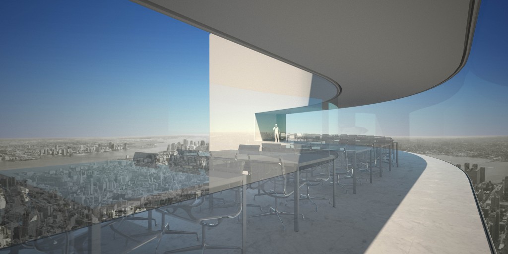
Three concave surfaces “funnel wind energy into several tiers of turbines,” according to a Design Boom article. Simultaneously, the foundation serves as roots, collecting geothermal energy. The concave areas also allow for public observation and gathering points, including a restaurant and observation deck on the forty-ninth and fiftieth floors. A variety of ground-level spaces, including an auditorium, conference rooms, and children’s library are powered by the tower itself. The concrete structure can be quickly assembled with speed climbing cases; wind and light can infiltrate the skin through perforated metal panels over parts of the facade.
The architect, who aims for beauty in the constructed environment while respecting the natural one, has embraced twenty-first-century minimalism in an extreme way, adding to contemporary dialog about architecture and innovation. Although his projects likewise require clients with a similar eye and taste, there is no doubt armchair travelers will be gazing at his buildings from afar as pure works of art.

