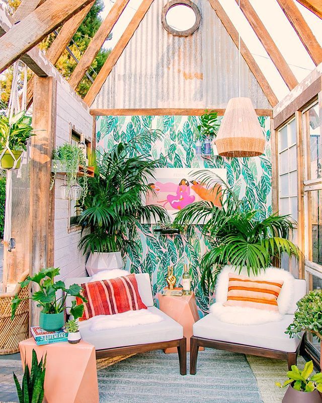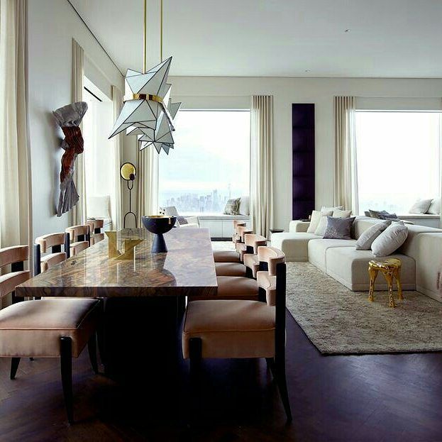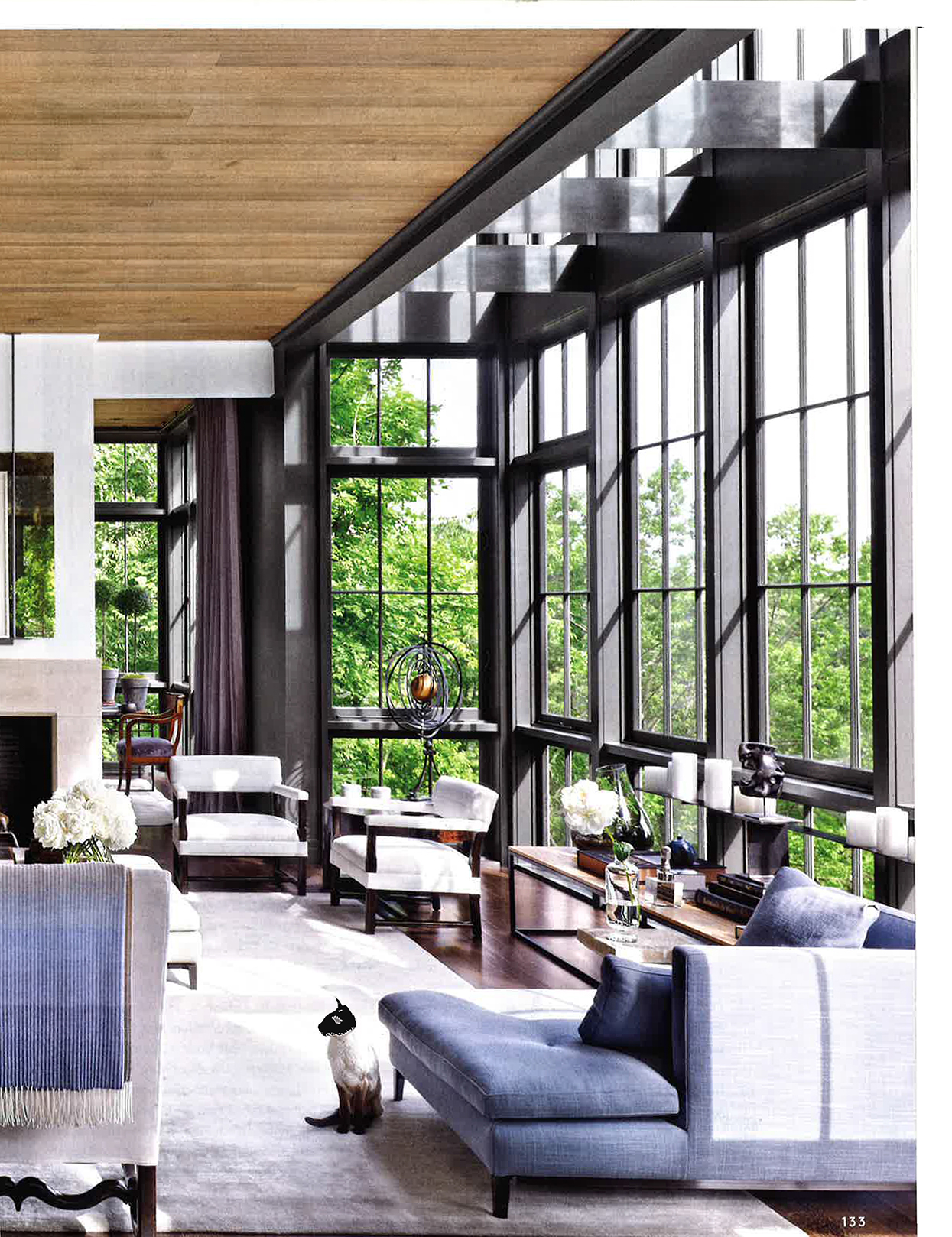
The weather is getting warmer and the days are longer. All we need is bright and soothing colors to relax our eyes and soul after a difficult winter. Soft, washed pastels like mint greens and sandy pinks are crawling into our homes. Pastel colors seem to be the new neutrals.
One of the top colors that stands out is the Ultra Violet , which was the Pantone color of 2018. This color is a safe zone when you want to escape from the hectic world we all live in. This color is often associated with mindfulness practices, the use of purple-toned lighting in meditation rooms and other get-together places energizes the people that gather there and inspires connection.
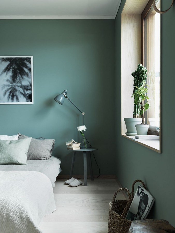
The new greens are in town and they have come to steal your heart. Forget about the Fifty Shades of Grey and get ready for the Shades of Green. We love the Celadon green which has its origins in the Korean pottery. The word “celadon” means green stone. Celadon comes in many shades and styles, being found in tones of light and dark gray, honey yellow, green and green-yellow, olive green, blue-green and brown, it is also known as a greenware color with a transparent glaze. Paint your bedroom wall with Celadon green to rejuvenate your body and mind.
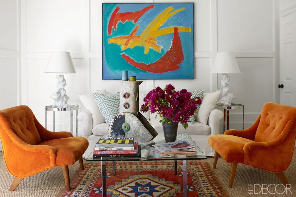
Squeeze our peach orange suggestions and be your own interior designer. A true orange is about fun, joy, and playfulness. It encourages social interaction in an amusing and conversational way. The peach color is a combination of pink and yellow and is associated with trust and openness. According to psychologists, the peach shade has an extremely soft energy that can restore mental illnesses. The peach orange adapts great with a vintage and romantic mood, because they both have a charming and retro nature. Quick tip
Squeeze our peach orange suggestions and be your own interior designer. A true orange is about fun, joy, and playfulness. It encourages social interaction in an amusing and conversational way. The peach color is a combination of pink and yellow and is associated with trust and openness. According to psychologists, the peach shade has an extremely soft energy that can restore mental illnesses. The peach orange adapts great with a vintage and romantic mood, because they both have a charming and retro nature. Quick tip: Pick the right colors that are harmonizing with each other otherwise you will find them to be fighting against each other and over time you will have difficulty living with them. Peach orange balances beautifully with wood furniture and neutral shades.
: Pick the right colors that are harmonizing with each other otherwise you will find them to be fighting against each other and over time you will have difficulty living with them. Peach orange balances beautifully with wood furniture and neutral shades.
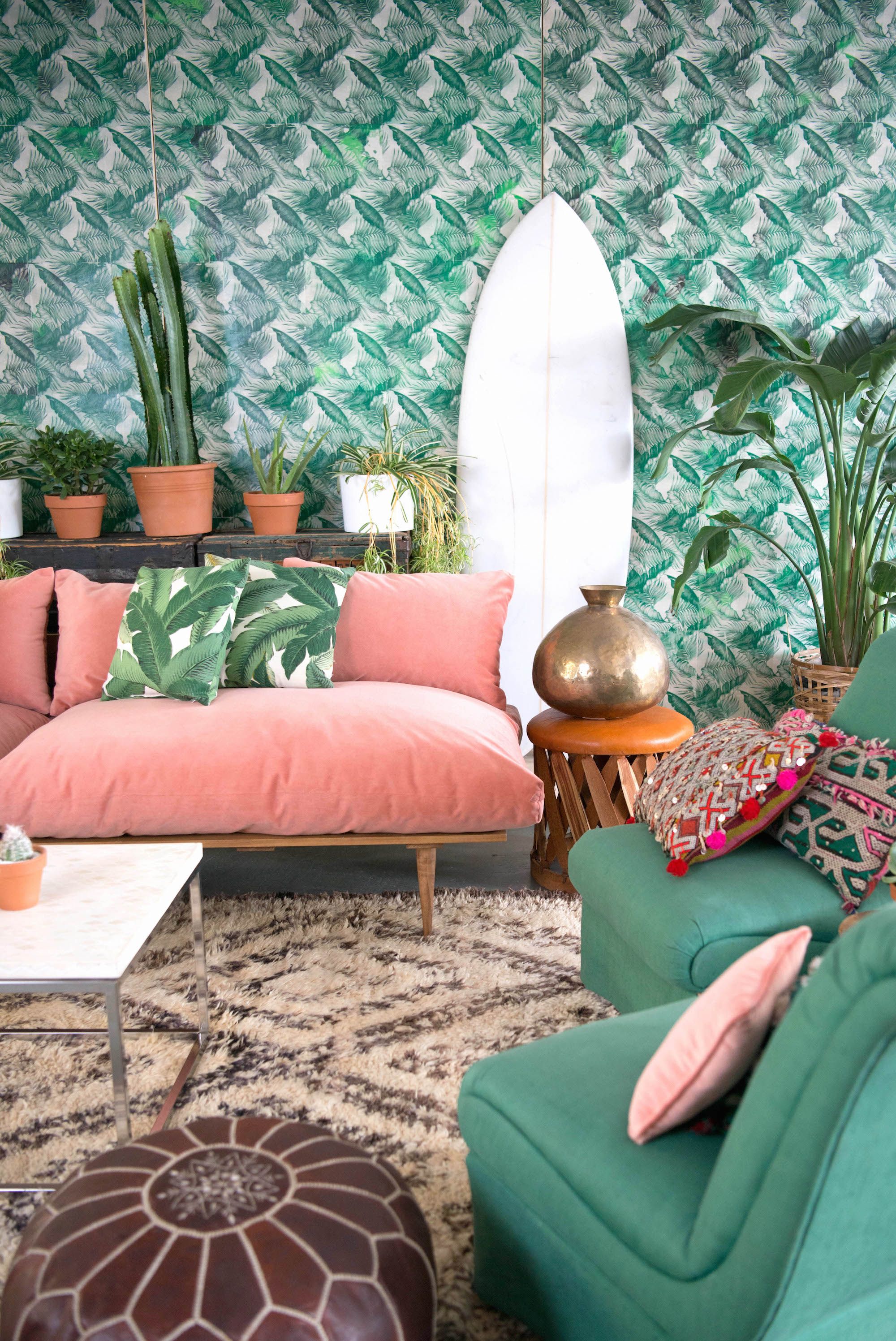
Be in touch with your innocent and pure side with the Millennial Pink. It is a tricky and controversial color. Some say is close to the skin color, some others a mix of grapefruit and salmon shades. So, let’s get this straight and find out where everything started. The reason behind the Millennial Pink is the Wes Anderson’s movie The Grand Budapest Hotel, because is centered on a building painted with several kinds of pink. This color is very well received and loved due to his gender neutrality and the fact that it is a fresh and playful color which brings out a vintage vibe. This pink obsession is spreading to everything, not only walls and furniture, but also white goods and decorative items. Could millennial pink go on to become the timeless pastel we’ve all been longing for?
