In previous features we have explored the effect of color on our perception of space and its link to human responses, now we dive even further into its influence on our emotions and behavior. This phenomenon that we know as color psychology is an indispensable aspect of interior design that guides us as we navigate through the use of color to evoke specific emotional responses according to the specific use of space. On the one hand, the emotional connection and response we may have to certain colors is strongly linked to individual experiences and cultural backgrounds; however, certain general associations can also be observed.
For example, the perceived psychological effects of cool and warm shades on our bodies encompass an increased heart rate and the stimulation of appetite (such as the case of red tones) or a calming effect and reduced stress levels with cool tones like blue and mint green. This phenomenon is so complex that we can also notice its influence on our emotions based on the way colors interact with each other. Therefore, whether we are seeking the visually stimulating strength of complementary colors or the balance created through contrasting shades; today’s piece will dive into the nature of each color through its relationship with the human brain and our interiors.
Call me red
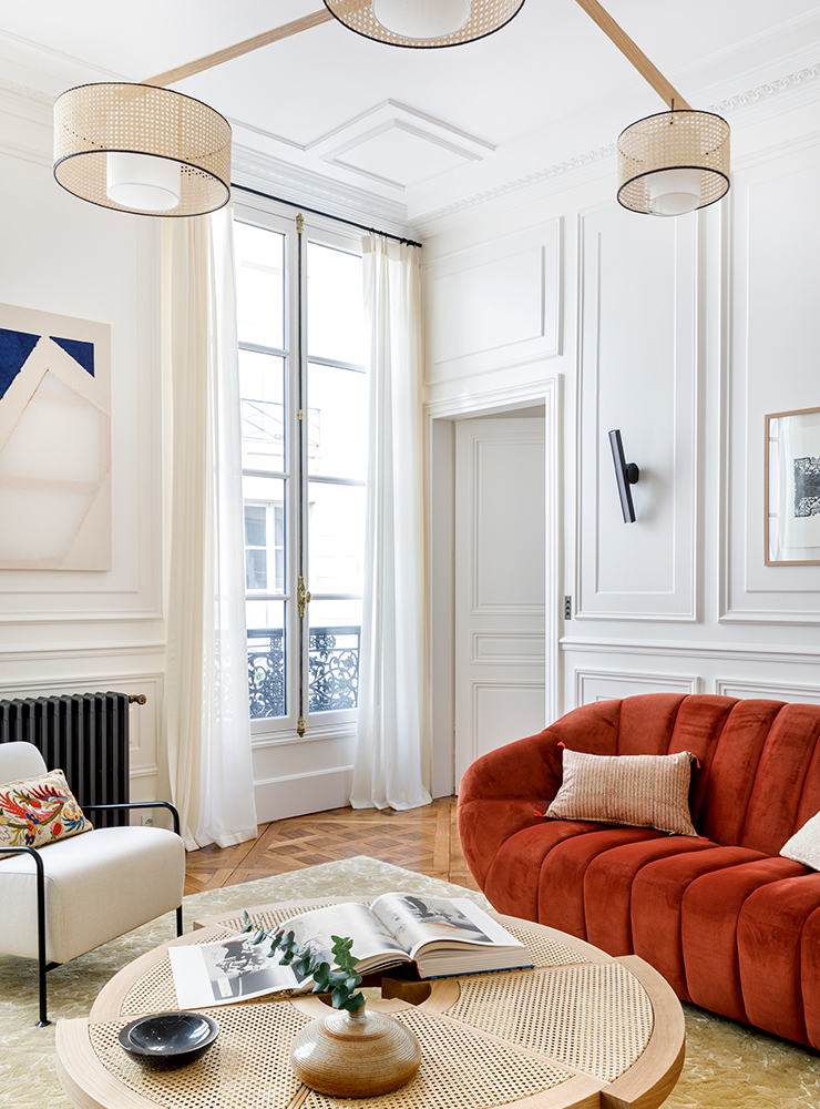
Associated with the strong drive of passion, love, and anger, red can subtly and unconsciously increase our heartrate and make way for excitement and intensity. This is why this color is especially useful as a beacon to draw attention and to stimulate appetite; thus, making it a common element in advertising and restaurant décor. There is nothing as bold and eye-catching as a red accent wall in a living room, complemented by red cushions on a neutral colored sofa that creates a balanced and vibrant focal point. A more functional-based angle can also include the use of red dining chairs in the dining area or red upholstered bar stools around the kitchen to stimulate appetite while crafting a sleek and modern look.
Calm under the blue
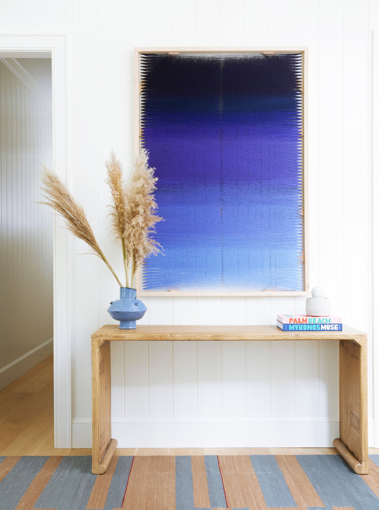
Instead of sadness and melancholy, we can associate blue to feelings of calmness and serenity. Its tonalities spreading across large surfaces such as a bedroom’s walls bring peace of mind and reduce the stress of strong visual distractions. This impression can also be carried to the living room for our guests to benefit from the tranquil atmosphere produced by the soft blue curtains or plush rugs combined with navy blue accent pieces like throw pillows and artwork. Each shade of this color can be used to add either depth and introspection such as indigo inspires, the luxury and drama of teal, or a refreshing turquoise; especially in seaside interiors.
Feeling grand in green
Through its connection with nature, growth, and renewal, green brings forth a sense of balance and harmony that opens up interiors to the beauty of the outdoors. As the first signs of growth, green elements are often associated with hope and fertility which makes this a refreshing color for homes through patterned upholstery, indoor plants, and furniture with velvet green embellishments. An olive green home office, for example, is useful for focus and productivity, or emerald tones accessorized with brass accents for a luxurious and classic feel. One can also embrace the boldness of mint green kitchen walls that form part of a refreshing ambience and which can also be found in lime green accent pieces like cushions or vases that exude playfulness and modernity.
A bright ray of yellow
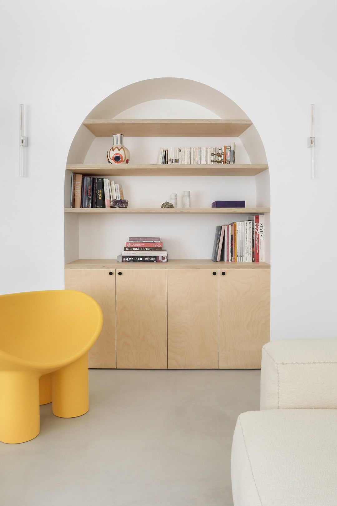
Beyond the cheerful and positive connotation of yellow we can also find within this color a source of increased mental activity and attention building. Like many factors in interior décor, its use must be balanced seeing as large amounts of this color can lead to feelings of frustration or even anxiety. Therefore, a safe approach to yellow can incorporate its charm in small amounts through throw blankets, accent chairs and ottomans or pale yellow walls which stimulate creativity and establish an energetic atmosphere. Imagine basking in the richness and comfort of a mustard toned sofa or armchair or admiring the luxurious effect that results from the combination between golden yellow textiles and dark wooden furniture.
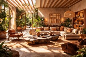
There is no sunset without orange
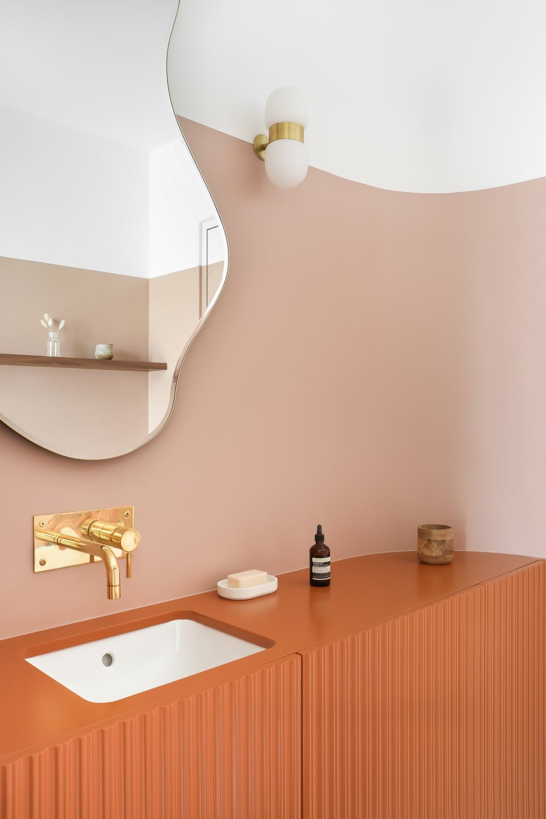
This vibrant color inspires our enthusiasm and creativity through its warm nature. In addition, its friendly and social aspect promotes social interaction and encourages communication, making it suitable for communal areas and meeting rooms. On cold or rainy days one can bask in the comfort emanating from an orange area rug embellished by the warm glow of candles. Our guests can also sense a welcoming feeling upon encountering the terracotta-colored walls of the entryway or hallway, like a kind embrace into your home. Lastly, as a stimulant for creativity, we can benefit by incorporating it into our art studio or office where it can lead to innovation and brainstorming.
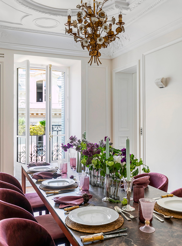
Enjoying every purple moment
The use of purple to dress kings and queens as well as their palaces, has made this a regal color that we tend to associate with luxury, creativity, and spirituality. Those who aim to embellish their interiors through its sophisticated angle can incorporate deep purple or plum-colored accessories, like artwork or vases with lush flowers to command elegance in a room. Luxury may come in the form of accent pillows, an area rug, or purple glass chandelier; however, we must not forget the duality of this color as it can also evoke a calming and dream-like atmosphere. This second aspect of the color purple can be found within a lavender tone in bedding or bedroom walls, purple armchairs in reading nooks, or in amethyst arrangements that serve for meditative and tranquil instances.
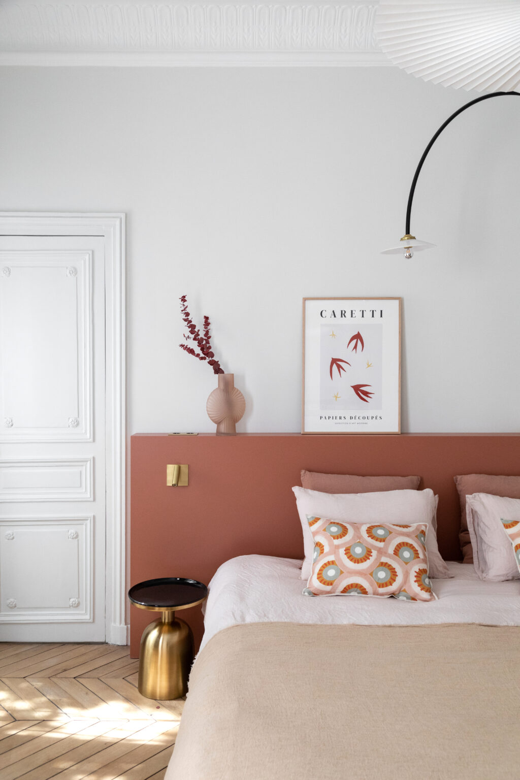
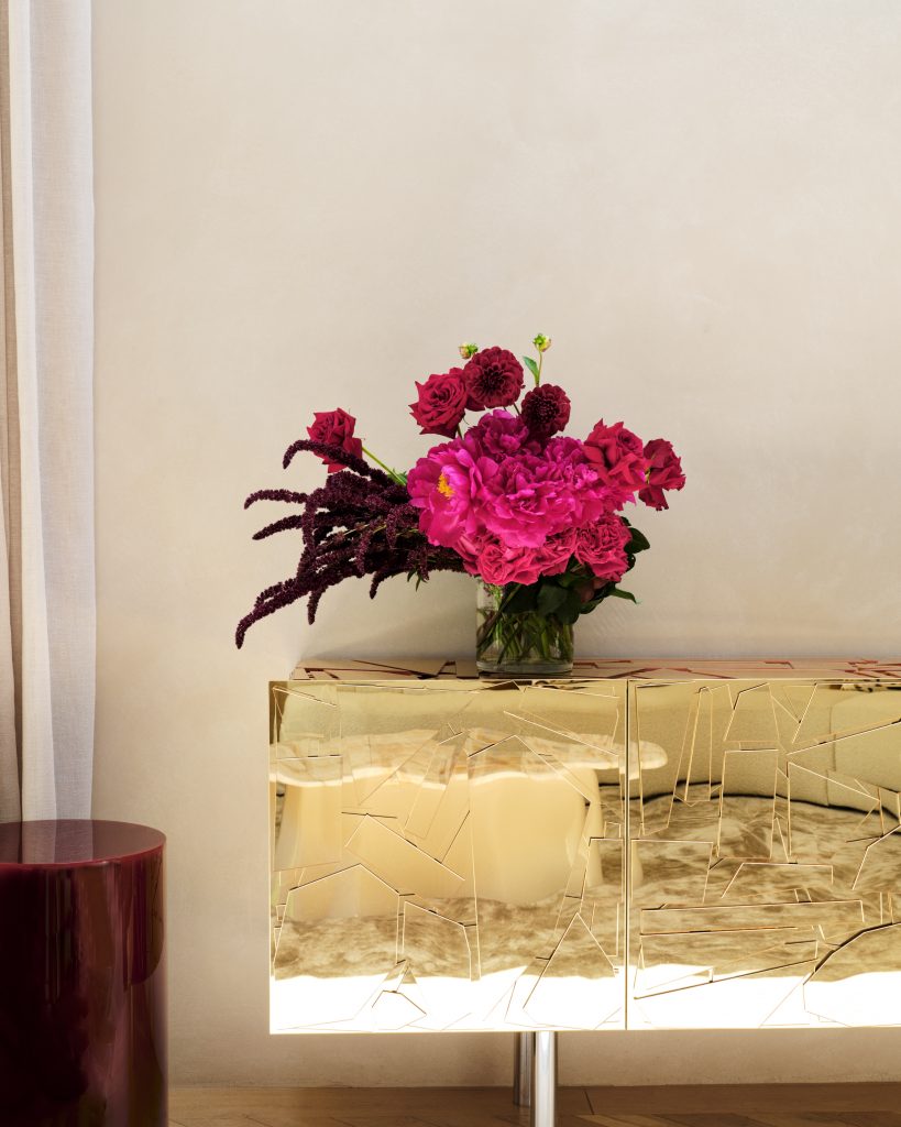
Pretty in pink
Soft and gentle, but also strong and bold; pink reminds us of the duality that exists in us and the inherent connection between sweetness, romance, compassion and youthfulness. This nurturing and sensitive color is commonly used to represent various concepts such as love, confidence, and grace thanks to its complex and multifaceted nature. On the one hand, we commonly observe children’s bedrooms painted with pastel pink walls that evoke a sense of sweetness, innocence, and tranquility. Meanwhile one can also explore a contemporary approach with sharp metallic pink furniture designs and artwork that challenges all preconceptions of this color. In vintage interiors, the presence of this color comes in a muted shade reminiscent of a nostalgic and romantic past through dusty rose curtains or upholstery. However, to bring us back to the present, we can incorporate coral pink patterns and decorative items that elicit our zest for life, creativity, and enthusiasm.
Living in color
Naturally, the amount of colors that we perceive day by day is much larger; especially if we consider all their individual variations and combinations. However, this brief look at some of the colors which embellish our lives is meant to paint an idea of how a single tone can influence not only our perception of an interior but our own emotions and behaviors in this space. Through interior design we strive to make life more colorful and harmonized with each individual’s feelings.