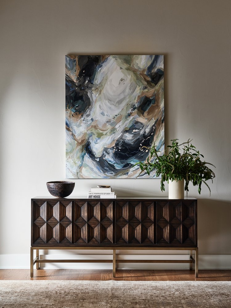
Picking up on the conversation around color in relation to interior décor and the emotional responses it can trigger, requires observing various approaches to styling color. In this case, one of such approaches encourages us to look at colors as coordinated units instead of focusing on their individual effect on human behavior. Coordinating color schemes can also generate specific emotions, ambiances, and design styles based on the juxtaposition of specific shades that add depth and interest to interiors.
The combination of beige and walnut, olive green and white, or indigo blue and caramel are ideal examples of complementary and contrasting color schemes that belong to a classic school of design. By exploring these three arrangements we can observe how the strategic use and mixture of colors can produce different effects on a room’s aesthetic and in the human brain.
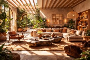
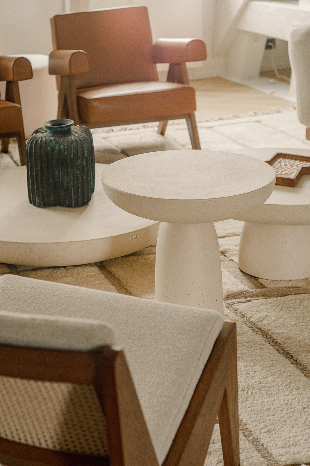
Beige and walnut
The warmth of these natural tones falls upon an interior like a calming veil with a neutral appeal. Instead of forging a connection through contrasts, the complementary shades of brown and beige bring a sense of balance due to their shared areas within the color spectrum. On the one hand, we have the cozy and welcoming atmosphere promoted by the use of beige while at the same time, the rich and earthy tones of walnut invite a strong connection with our surroundings. Together, both shades serve as a neutral backdrop allowing furniture, artwork, and décor to stand out and accommodate different styles and themes.
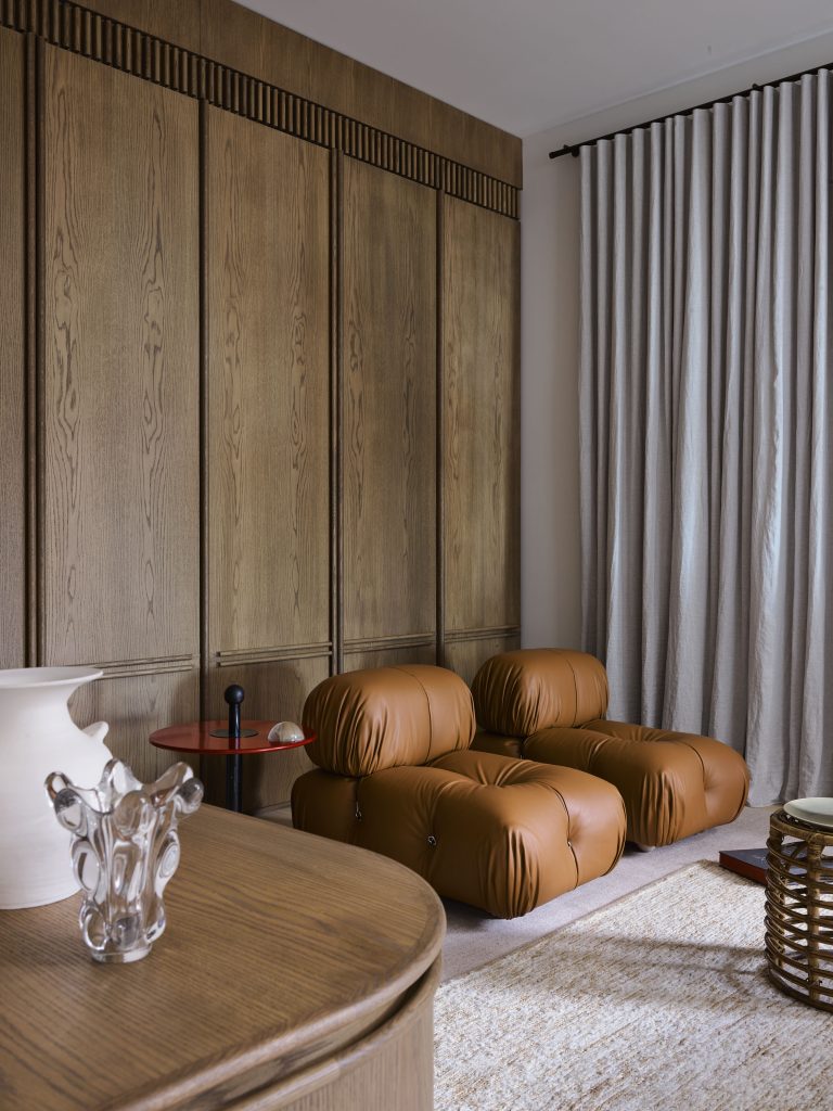
The natural aesthetics of beige and walnut create a soothing environment that connects our interiors with the outside world. One can easily incorporate these colors in their natural state using a beige sectional sofa with walnut legs as a centerpiece of a room, a walnut coffee table accessorized with beige throw pillow and a matching area rug, or in smaller surfaces through walnut-framed mirrors or beige bookshelves. In addition, this color combination provides a flexibility in styling as their simple nature can make room for a variety of colors from vibrant shades that add an energetic look or other neutrals that create a serene and minimalist ambience.
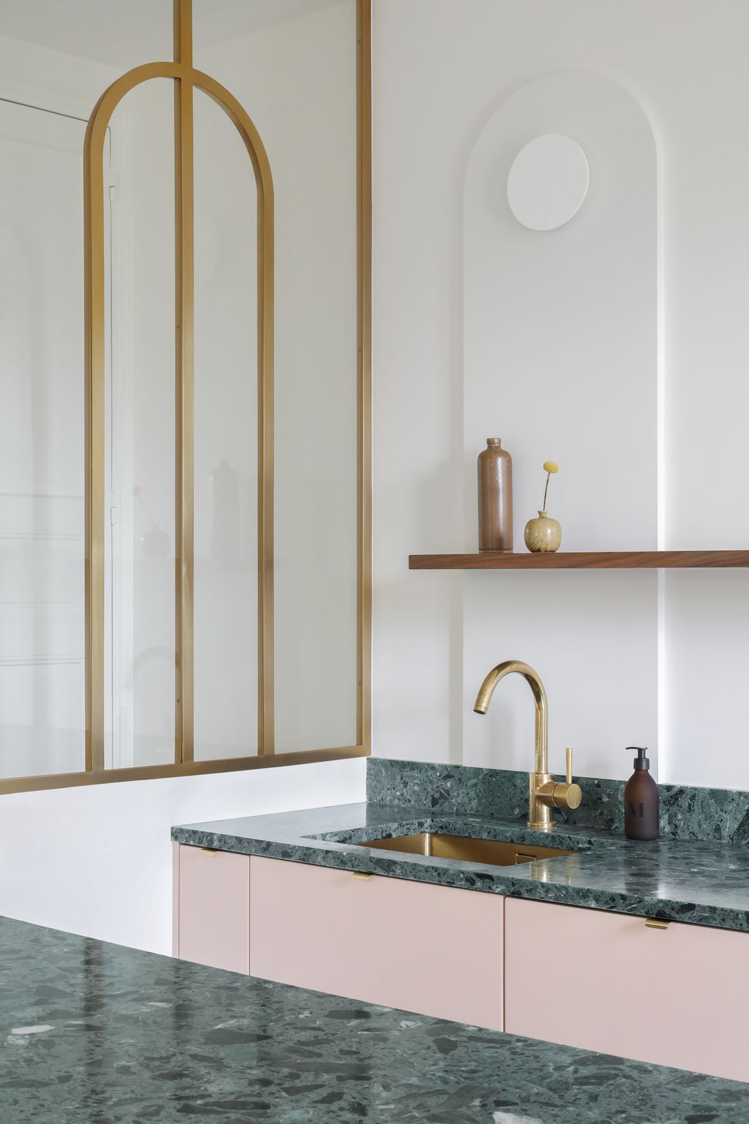
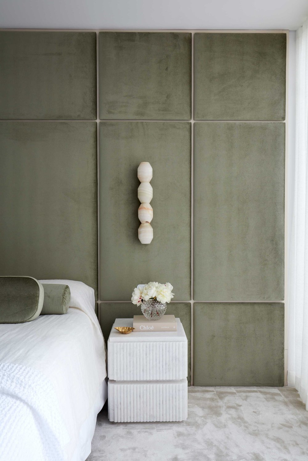
Olive green and white
In the case of this color combination, the harmony between each tone’s attributes lies in the use of contrast. By itself, the earthy tone of olive green reminiscent of the hues found in foliage and forests is enough to generate a sense of tranquility. However; when paired with the refreshing and classic appeal of white, this visual effect leads to a sophisticated and timeless feel. At the same time, one can admire the continuous interaction between both colors through their relationship with light. While the reflective nature of white helps brighten up a space and creates the impression of openness, the intensity of olive green adds a touch of depth and character. Each tone ensures that the intensity of the other does not become overpowering, thus presenting the perfect opportunity to introduce other elements such as textures and materials into the design.
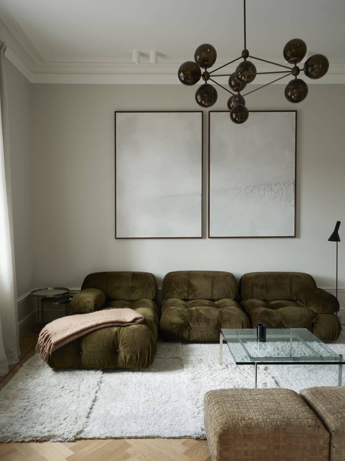
This bedroom’s sophisticated look carries a faint Mediterranean air that reminds us of the comfort we find under the shade of an olive tree and the effortless beauty rooted in bright white seashells. One can also use both colors to transmit a different feeling by arranging their use with varying décor. In the case exemplified below, we find tranquility through the use of these colors in oversized surfaces and within plush textures like velvet and cotton. However, one can also take a rustic approach by designing a kitchen with olive green cabinetry against white tiled countertops mixed with natural wooden elements in the form of exposed beams. The same color scheme can also form part of a more modern dining room or an elegant bathroom décor. The idea is that besides color, texture and the combination of materials also plays a role in defining the atmosphere of a room.
Indigo blue and caramel
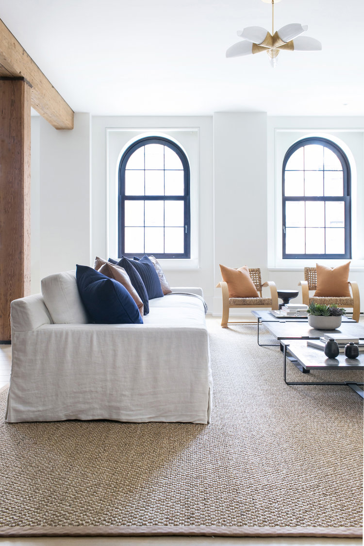
Indigo is a color full of mystery and a magnetic appeal with a strong aesthetic connection to early human civilizations. Its cold hue has an overwhelming effect by itself; however, when paired with a warm tone such as caramel, it leads to an intriguing balance full of depth and organic appeal. The two colors are instinctive companions as we can observe in the natural world where earth and water share a single canvas. Together, indigo blue and caramel evoke a sense of luxury and opulence that can be best integrated through textiles and furniture. Nonetheless, the richness of these tones also integrates the calming effect that blue has on the mind and the comforting touch of caramel; thus ensuring an aesthetic and alluring ambience.
The combination of indigo blue and caramel as arranged in this living room recreate a coastal atmosphere. In this case, this effect results from the incorporation of a third color which adds a touch of brightness that is characteristic of seaside interiors. The use of white as a background for the indigo-caramel color scheme creates a refreshing and calming ambience. In other cases, one can also look at both colors in isolation as the main characters in a transitional living room or a bohemian bedroom for example. Imagine deep blue indigo walls surrounding caramel-colored leather sofas and a matching area rug with dark wooden furniture and a touch of metallic accents in the lamps to add dynamism. Or in the case of a bedroom, this combination can also incorporate a focus on texture through the use of blue tapestries and caramel toned bedding with tassels and rattan furniture.
The act of deliberating between color combinations is more than an aesthetic task. The philosophy behind color psychology demonstrates how each shade and color scheme taps into specific associations and emotions. Therefore, the arrangement and combination of tones is an act of self-reflection that demands awareness of the influence of design on our behavior. Whether it is through the coordination of indigo blue with caramel, walnut and beige, or olive green and white, all three possibilities are timeless examples of combinations that bring beauty and harmony to interiors while also soothing our minds.