In design just as in life, there are frameworks and guidelines set in place to ensure harmony and beauty. The fundamental principles applied to design have been perfected over the years based on human perception, psychology, and design theories. Being aware of these principles allows designers to create functional, aesthetically pleasing, and meaningful spaces that improve the quality of living for the people who use them. For this reason we give you a glimpse of what seven of these fundamental principles are and how they can be incorporated into your homes.
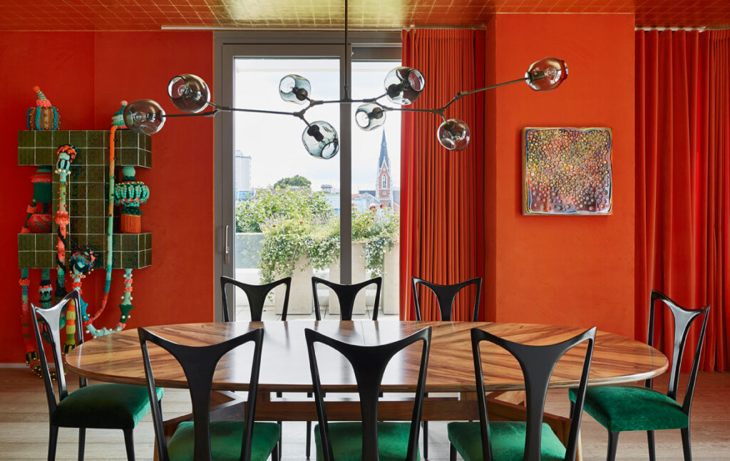
Balance
A balanced interior design strives to make justice to the materials and furniture you have chosen by creating a harmonious composition where these items may stand out. This requires distributing visual weight and arranging elements in a comfortable and pleasant way as well as maximizing the functionality of a space.
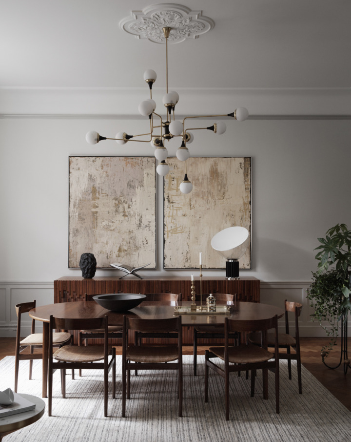
On the one hand you have the aesthetic benefits of a balanced composition which influence the creation of a calm, orderly, and harmonious mood. Additionally there is also the practical aspect behind this principle of interior design which aims to optimize the flow and functionality of a space. This can be achieved by arranging furniture in a way that enables easy-movement, creating openings through which natural light can travel, and thinking about the ways each element complements one another. A good place to start is by selecting focal points within a room based on the strategic placement of particular furniture, artwork, or architectural features with varying visual weights. Distributing these elements in a stable manner can add depth and interest to a room as well as consistency.
Unity
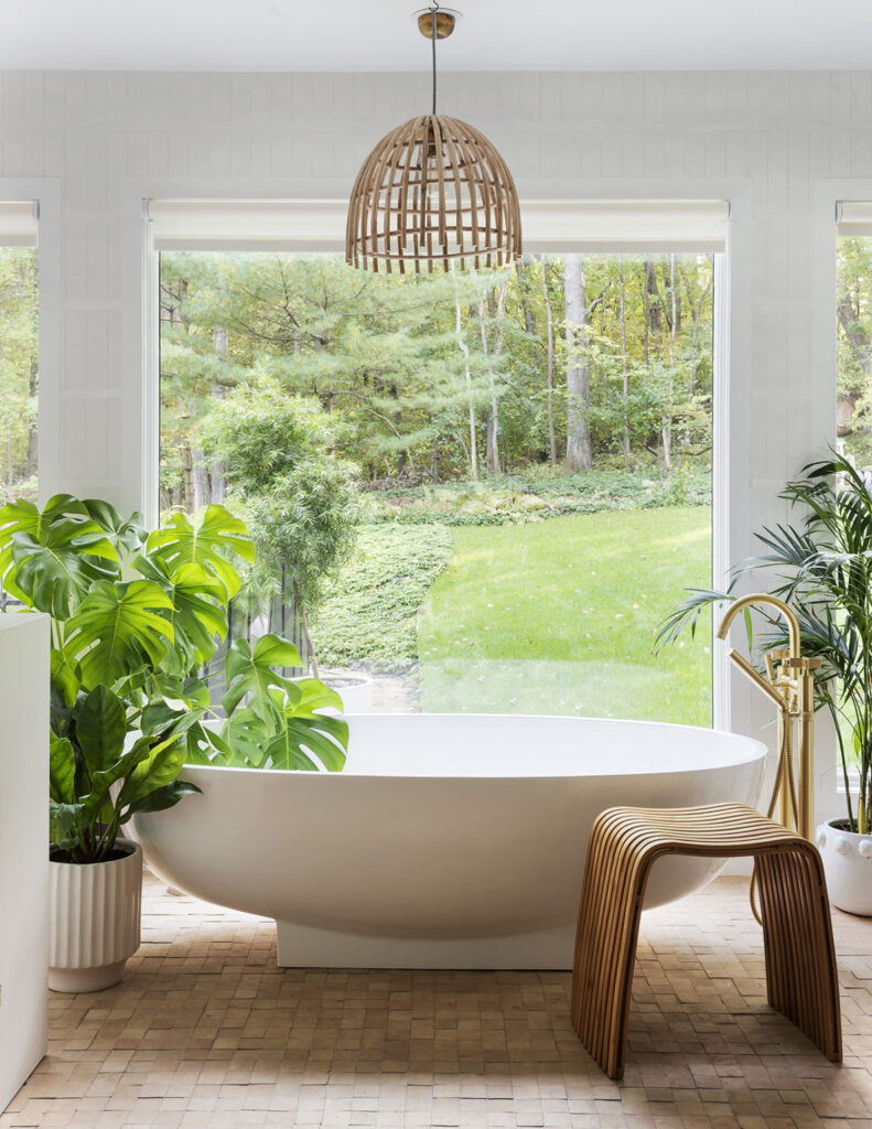
A cohesive design requires both balance and unity. As mentioned earlier, the first is about creating a visual equilibrium and harmony within a space. Meanwhile, unity shifts the focus to the relationship between the different elements within a room in order to create a cohesive whole. This requires us to pay attention not only to the colors, styles and materials but also the use of repetition, proportion, and scale in combination with one another to tie the design together.
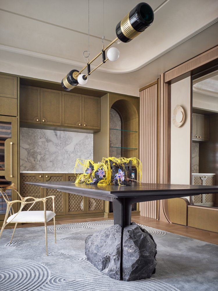
Incorporating a consistent color palette based on complementary or analogous colors through walls, furniture, and accessories can become the guiding thread that highlights the atmosphere of a space. This is also related to the use of repetition; whether through color, motifs, texture, or shape- this strategy helps to reinforce a unified look or a particular style. However, since unity is not only dipendent on the use of recurrent elements, we must also look at the consistency of furniture and objects’ scale and proportion. Items should be arranged in relation to one another based on size and to add an extra flair, they can also be coordinated according to their materials and finishes. Wood tones or metal finishes are often subtle ways one can connect the different elements and objects in an interior.
Rhythm
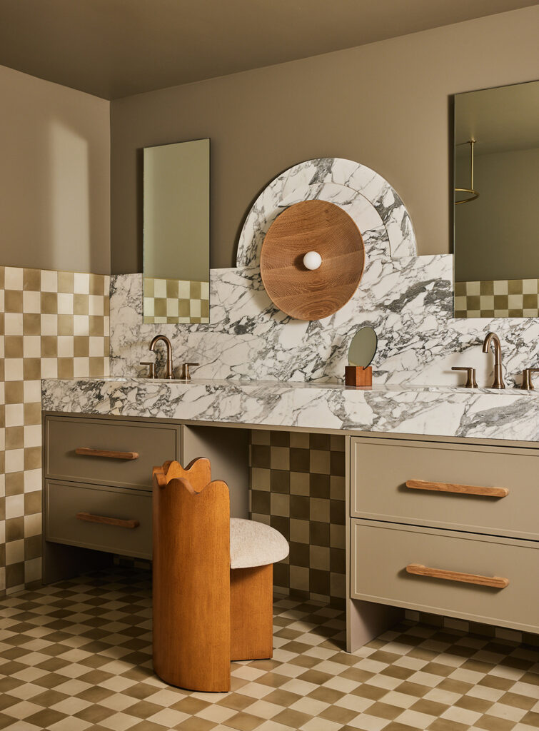
In both music and in the spaces that envelop us, rhythm is meant to bring about movement and flow through progression, repetition, or alternation. This dynamism translated to interior design is what endows a space with visual interest and liveliness.
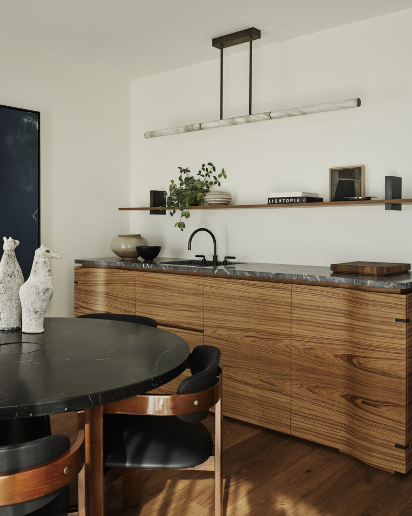
At first we have the use of repetition through shapes, patterns, colors, or textures which provide a sort of visual beat that plays as softly as a suggestion in the corner of our gaze. This is followed by progression: the gradual change or transition of a series of objects that increase or decrease in size, color or shape. This is commonly seen in sets of pendant lights which come in varying sizes arranged in sequence; not too obvious but just visible enough to entertain the viewer. This leaves as the next step the use of alternation; a back-and-forth repetition of objects, patterns, or colors; thus reminding us of the natural cycle to which all elements in this Earth are subject to.
Emphasis
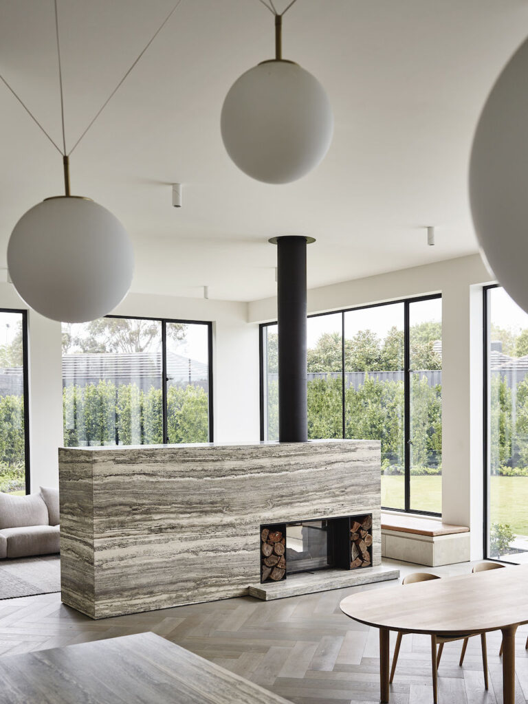
In the midst of all the different elements that make up an interior, emphasizing a specific area or creating a visual reference allows you to enhance the impact of a space. Adding a center of attention creates a sense of visual hierarchy that is needed to guide viewers and reveal the character of a room. Such focal points can range from unique artwork or accessories that highlight your own personality, to architectural features such as a classical fireplace, an exposed brick wall or a grand staircase that already present themselves as natural centerpieces.
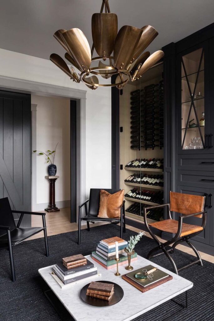
Emphasis can be established through color by incorporating bold, vibrant hues or pops of color amid an otherwise neutral space to draw attention to a specific area. This use of contrast can also be adapted to scale and proportion by playing with size differences to create a strong impact in a room. For example, placing an oversized, unique piece of furniture or artwork against a textured or patterned wall can easily become a focal point. The only approach that could add more depth and emphasis is the use of proper lighting such as spotlights or accent lighting which direct our attention to a specific element, item or arrangement in a space just like stage lights guide us through the shifting dialogues in a play.
Contrast
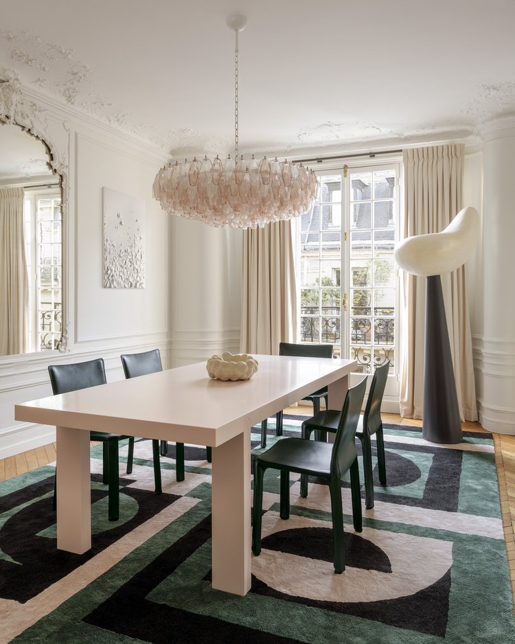
Contrast plays an unmistakable role in reinforcing the fundamentals of interior design that we have mentioned above. However, by looking at this approach on its own, we can observe how the juxtaposition of objects with different natures can create depth and a noticeable distinction. The most notorious way of creating contrast is through color, size, and lighting. Cool blue and green tones against warm shades of orange and red or the combination between light and shadow can even bring a dramatic flair to your interiors that is difficult to achieve with monochrome or neutral approaches.
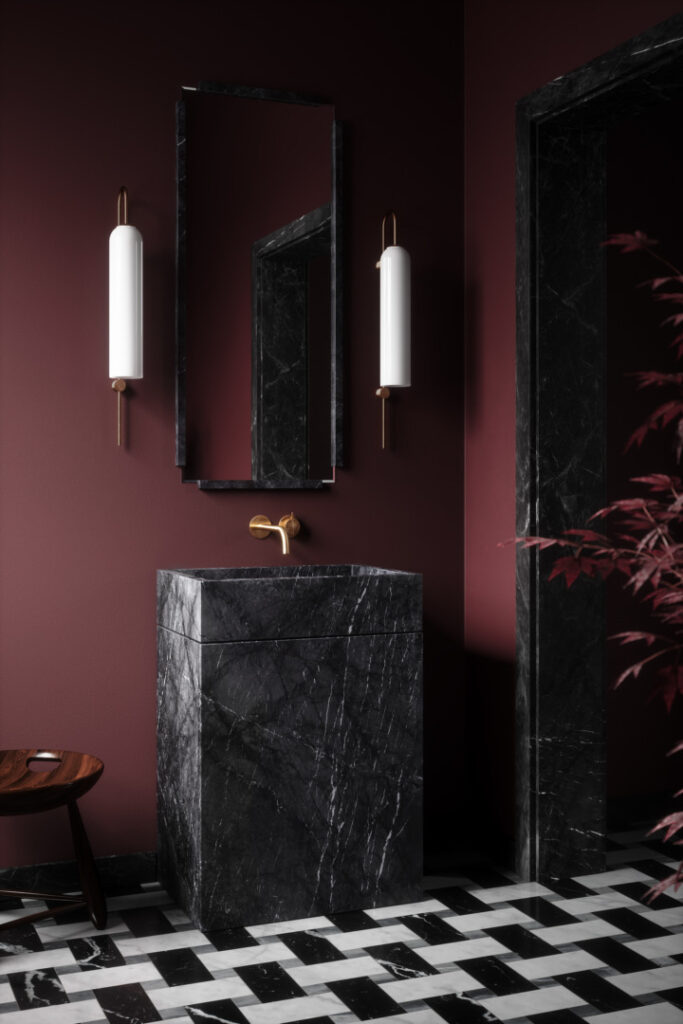
A less obtrusive way of creating contrast is through texture, shape, pattern, and materials. For example, imagine a sleek reflective countertop against a textured backsplash that adds visual and tactile interest in a space or the mixture of curvilinear and geometric forms to add excitement and a break from monotony. In the case of patterns, think of using varying motifs or designs based on a scale system starting with a neutral base and pairing it with more exciting motifs to ensure that contrast does not turn into full maximalism.
Scale and Proportion
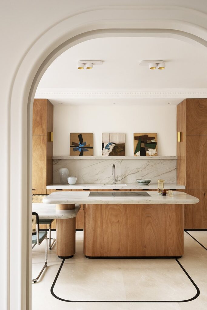
These fundamentals of interior design guide the relationships between objects and elements within a space based on their mass. This is especially useful when considering the functionality of a space, seeing as the dimensions of a room and the scale of furniture and objects is largely dependent on human proportions and movement. Ensuring that pathways are maintained clear not only provides visual appeal and tranquility but it also allows for comfortable navigation and efficient use of space.
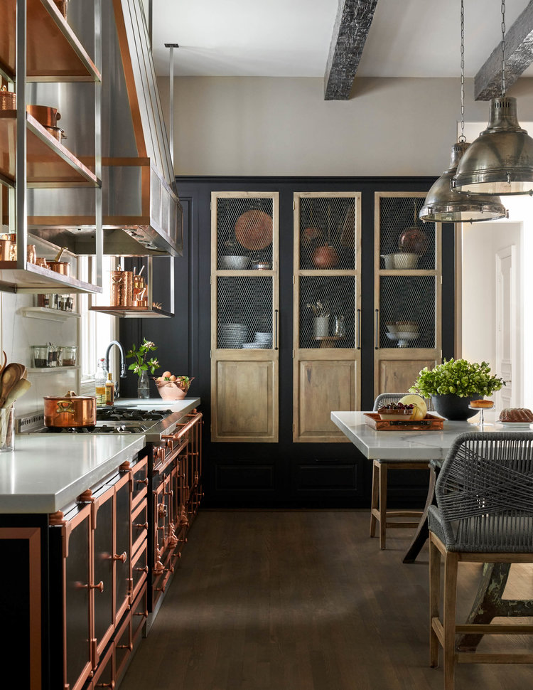
When planning room layouts and selecting furniture one of the first natural instincts is to compare sizes and ensure that these elements are proportionate to the scale of the room. Oversized furniture in a limited area can make a space feel cramped or overwhelming while small furniture in a large room diminishes the impact of the composition. This is also why it is important to place scale and proportion in relation to harmonizing architectural features with the scale of furniture, fixtures, and finishes.
Details
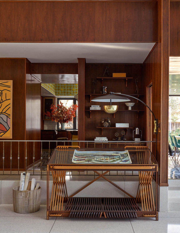
Never underestimate the transformative power of details. The careful consideration that goes into the incorporation of small elements, accents, and finishing touches enhances the overall aesthetic of a space and reveals something about our own persona. They can include decorative items, trimmings, hardware, patterns or even textures that contribute to the personalization of a space and add richness and complexity to a design. On the one hand, they can be added by carefully selecting the textures, patterns, and materials that create depth and layers in a multidimensional space. Otherwise, they can also be found in more functional-based items or crafted objects that add value to practicality and quality.
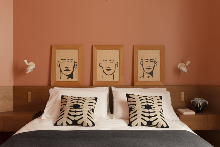
A way that details can enhance the usability and efficiency of a design is through the use of innovative storage solutions, specialized hardware, or integrated technology that addresses your specific needs within each space. In addition to this, thoroughly chosen and executed details offer a sense of craftsmanship and quality; not just practicality. They can communicate the care invested into a design and reveal something about the overall perception and value of a space.
End note
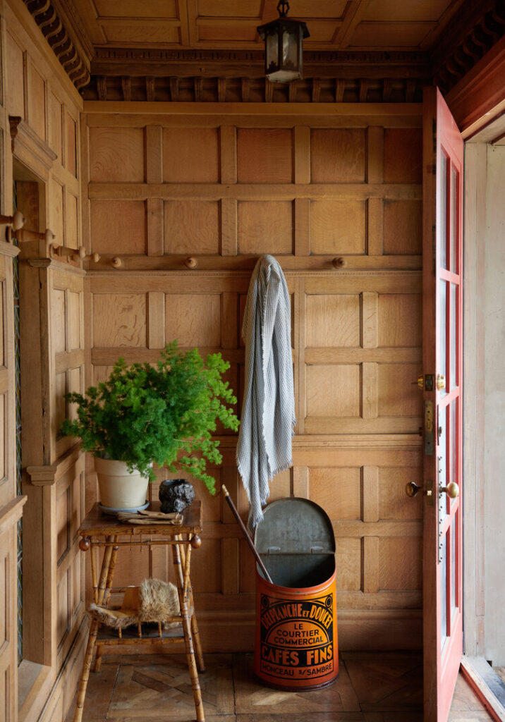
The seven principles of interior design we have discussed above aim to create a positive user experience by establishing a solid foundation from which designers can solve problems effectively, communicate their clients ideas in the interiors, and create pleasing and purposeful environments. Being aware of these principles, even as a customer is important as a means of understanding the thought process that goes into developing more than aesthetic spaces. These are the fundamentals that carry the whole design of your interiors and therefore, they are also directly linked to your own wellbeing and experience at home.

